Counterpoise
1,507 sqft ︱3 Bedder Apartment
A point of arrival
Some homes are born out of necessity.
Others emerge at a point of arrival.
Counterpoise was conceived during a transitional moment in the lives of its homeowners, a couple in their late thirties stepping into a new chapter after years of building and recalibrating. Having moved on from their first home, they approached this project with renewed clarity. They wanted a space that reflected not only their present circumstances, but also their evolving sense of self.
This was to be a home shaped by intention rather than accumulation. A place to slow down, to host, and to live with materials that could be felt as much as they were seen.
Holding contrast
From the outset, the design was anchored by contrast. Not as opposition, but as balance.
The couple held differing preferences. One gravitated toward darker, more grounded environments, while the other was drawn to light, openness, and natural illumination. Rather than softening these differences, the design embraced them, allowing light and dark to coexist in measured equilibrium.
The interplay of stone, metal, and timber is reinforced by a quiet tension between curved corners and sharp lines. This shapes both the spatial sequencing and the material language of the home.
Compression and release
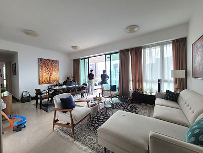
The home opens with restraint. The entryway is kept deliberately dark and subdued, offering only a glimpse of the living space beyond. As one moves inward, the interior gradually opens into a brighter, more expansive living and dining area.
A television feature wall spanning over four metres anchors the communal spaces. Acting as a spatial spine, it connects the entryway, living, and dining zones, elongating the interior while quietly guiding movement through the home.
Private areas are concealed behind the dining feature wall and accessed through a discreet integrated door set beside a custom calligraphy artwork bearing the Chinese text 感恩 (“grateful”). This serves as a quiet acknowledgement of the clients’ stage of life and their cultural roots, reinforcing a sense of containment away from the communal heart.
Material as structure
Materiality plays a central role in shaping the atmosphere of Counterpoise.Italian stones, including Calacatta Viola and Bellezza Nera, are used with intention and restraint, lending weight and permanence to the interior. These are set against warm, muted whites and cool-toned dark wood joinery, with metal accents introduced sparingly to provide depth rather than shine.
Fluted limestone surfaces add a quiet sense of cultivation. Understated and composed, they carry a distinctly Italian sensibility that gestures toward both classical and modern architectural language.
Softness within discipline
Curved silhouettes appear subtly across the home, softening its architectural language through ceiling coves, feature walls, furnishings, lighting, and tapware selections.
Rather than dominating the space, curvature is counterbalanced by linear, disciplined joinery.
At the television wall, the Ross Gardam Ceto pendant casts a restrained pattern across the adjacent brushed bronze surface, introducing a delicate luminosity within the otherwise grounded composition.
.
A private moment
One of the most considered moments lies within the master suite. Here, the bathroom layout was reimagined to transform a functional routine into an experience. The vanity, now positioned beside a window, is separated from the shower and WC, allowing natural light to wash over a custom Calacatta Viola basin. Visible from the bedroom, this sequence unfolds as a pause between spaces.
For parents navigating the pace of daily life, this moment offers a brief but intentional respite. It is an intimate interlude within the home, where materiality, light, and movement converge.
What was withheld
Restraint is evident not only in what was designed, but also in what was consciously omitted.
Warm-toned timber, excessive curvature, overt overhead lighting, and saturated colour were deliberately withheld from the foundational works. Instead, atmosphere is shaped through ambient light, filtered daylight, and material contrast. Colour is reserved for furnishings, art, and personal objects that will continue to evolve with the family.
In balance
Counterpoise reflects an assurance in holding opposing preferences in balance, without compromise. Restraint, contrast, and clarity emerge as guiding principles throughout the home.Rather than resolving difference, the home allows it to exist. Balanced, intentional, and composed.


The Look

HC28 Cosmo Cala Lounge

DCW NL12 Ceiling Lamp

DCW Armen Table Lamp

Georg Jensen
Botanica Vase

Calacatta Viola

HC28 Cosmo Viva Table

HC28 Noa Chair

Ross Gardam
Ceto Chandelier


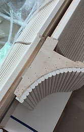
Behind-the-scenes


_edited.jpg)
_edited.jpg)
_edited.png)
_edited.jpg)

_edited.jpg)